The business and marketing education firm CXL has a lengthy but thoroughly accessible description of core Web Design Principles. Since many hosting platforms already address many of the design elements in their templates, what follows focuses on just three aspects of web design that have a direct bearing on content.
Because you don't know your your website guests, prioritize accessibility at every step of the process. Here are great resources to help you think about an accessible website and test the accessibility of your own:
Visual hierarchy is the way content is laid out on the page to give visual queues about what's important and what's less important. The numbers on this image of a Williams Sonoma website identify the hierarchy of visual information:
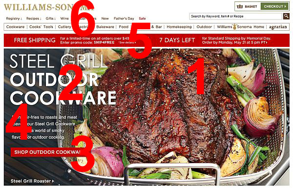
(example drawn from CXL post 8 Web Design Principles and Laws that Work in 2023)
Negative space, also known as white space or clean design, is the space on your webpage with no content. Negative space minimizes the cognitive load on your guest as they view your site, prevents cognitive overload and paralysis while looking at your site, and overall improves their user experience.
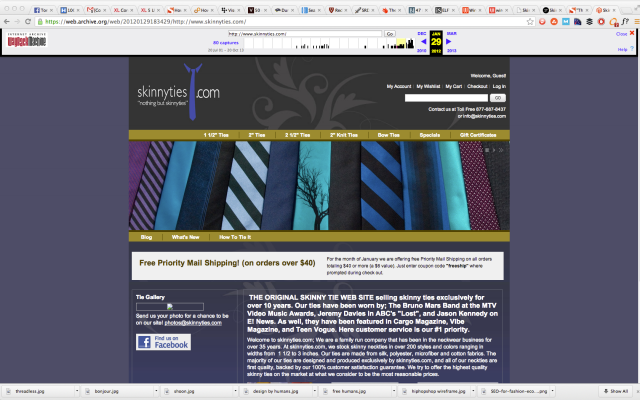
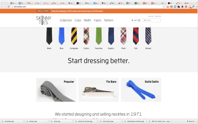
Here is an example of how negative space can be used to improve the user experience:
Before:
After:
Simplicity goes hand-in-hand with negative space. Websites are public spaces, for people both on and off university campuses. Jargon gets reduced, syntax becomes more conversational, and word count drops. A picture (with a little bit of explanatory text) is worth a thousand words, if you can convey your complex topics in graphics, do it.
Personal websites are not business websites, but the core design principles remain.
For a fun exercise and to get thinking about how to organize your site and what content you need to develop, check out the professional websites below and think about the follow prompts:
Lindsay Cronk, academic librarian
NeatLabs,Neural Engineering and Translation Labs at USCD (check out lab co-director Dr. Jyoti Mishra's article "Use Your Lab Website to Make a Compelling First Impression")
Gary Sheng, creator and entrepreneur
Brandon Johnson, planetary scientist
Martine Myrup, artist
Prach Boondiskulchok, composer and pianist
KM Dance Project, dance
HubSpot's Best Personal Websites: 35+ Examples to Blow Your Mind offers a wealth of examples to draw design inspiration from. Each example site is accompanied by a brief critique identifying the elements that won the personal website a spot on the list. This article is full of good tips by example.
